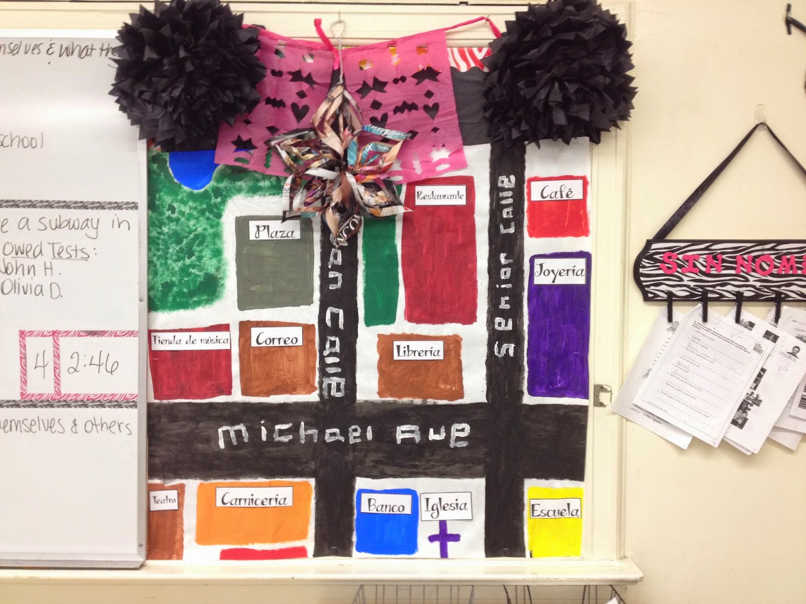
I am such a sucker for pretty things. Now, you KNOW that means my bulletin boards must match my pretty things mindset. I know most Spanish teachers stick with the standard Spanish boards and I did too, for a while. Then, a couple of years ago I started to make some changes. I still like the content of my boards to be related to my subject matter (of course), but I don't like them looking traditional as I am anything but.
In my old classroom, I had bulletin bulletin boards inside the room and also a nice wall outside of my classroom that I used. I didn't make the best boards outside the room because I couldn't put up paper, borders, etc., but I still used the space like I did here with an extra credit project I did with my students asking them to portray why it's important to learn a second language. I actually took this idea and am using it again as my start of the year bulletin boards for next year since I want to spark interest with my new students by featuring my old students. In fact, I had a student make me the large Instagram poster (he drew and painted it) that I'm using again next year in a different purpose.
 |
| #WhyStudyLanguages bulletin board (outside of classroom) from 2012-2013 school year. |
Now, in my new classroom (2013-2014), I embraced the idea of wrapping paper instead of bulletin board paper and even used some plastic tablecloths later in the year (sorry, no pic) along with tissue paper flowers and even some papel picado made by a student (cut up tissue paper used in many Day of the Dead celebrations). Of course, I had a very "loud" room last year as my new room was desperate for some paint on the walls and I had to make due this year and cover up the disgusting leftover tape (that was practically glued to the wall) from moving in. It took a year, but the room will be painted this summer so I don't need to cover anything up like you see I did below.
 |
| Though I'm re-using the Instagram sign a student created for me a few years back, this board is new all together. I took inspiration from this Pin but realized I really couldn't do something like that on my door. So, I took it inside my room and made a little bulletin board of snapshots of Spanish-speaking countries. This was especially important to me because we'll be traveling to Spain for my FIRST trip abroad with students in 2016 and I wanted to make sure I had something to "sell" the trip to my incoming students. |
I still have a lot of work to do in my classroom, but my hands are tied until everything is painted. Hopefully this will help to inspire you. What are your bulletin boards looking like??


Love your #whystudylanguages! Do you have a rubric or handout you'd be willing to share? Hoping to motivate my level 1s with "words of wisdom" from both current and past "advanced" students! Merci/gracias!!
ReplyDeleteHi Kelli! Thank you so much for your comment. I didn't actually have a rubric for this as it was a last minute extra credit assignment I offered two years ago. What I did was have my students research reasons it is important to study a foreign language. Then when they found one that interested them, they had to make a decorative sign about their choice and photograph themselves holding it. Lastly, they had to upload it Instagram and hashtag it #whystudylanguages so I could find it. The way I "graded" the assignment was simple - they received 3 points if they blew me away, 2 if it was good, 1 if enough effort was made to warrant receiving extra credit. If I had received poor assignments, I would have not given extra credit, but that didn't happen. I hope that helps. If you develop something, I'd love to see what you come up with. :)
DeleteYour room looks amazing!!!
ReplyDeleteI LOVE your room!! I always have the students answer why it is important to learn another language at the beginning of the year, and some enjoy it more than others, but if they knew they would have their picture taken with their answer, it might make them more interested! Also, the Para ti section of your classroom is great, to eliminate confusion! Thanks for sharing!
ReplyDelete